Energy One
Landing Page
Project Details
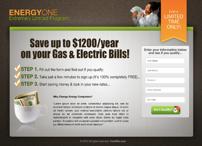
Client wanted a corporate landing page in brown and orange, which was interesting to look at, easy to read, easy to sign up to, just simple. *Note: In this screenshot you can see the logo from the stock photo site I used in the coffee cup. Client did eventually purchase stock photo so we could remove that. 🙂
